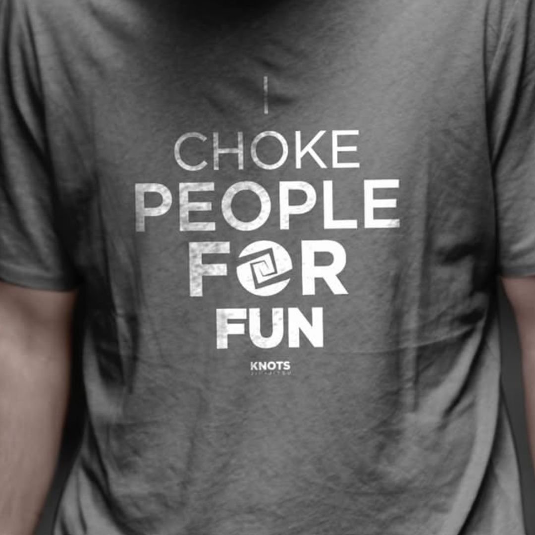
Jiu-jitsu is the art of control, of tying movements together with precision, strength, and unity. For Knots Jiu Jitsu, the brand needed a symbol that embodied these values something deeply rooted in the essence of the sport.
The logo concept was inspired by the power of knots, a perfect metaphor for resilience, connection, and the unbreakable bonds formed through training. Two hands intertwine to create a structured, yet fluid knot representing not only the techniques of jiu-jitsu but also the unity within the community.
02 . The Solution
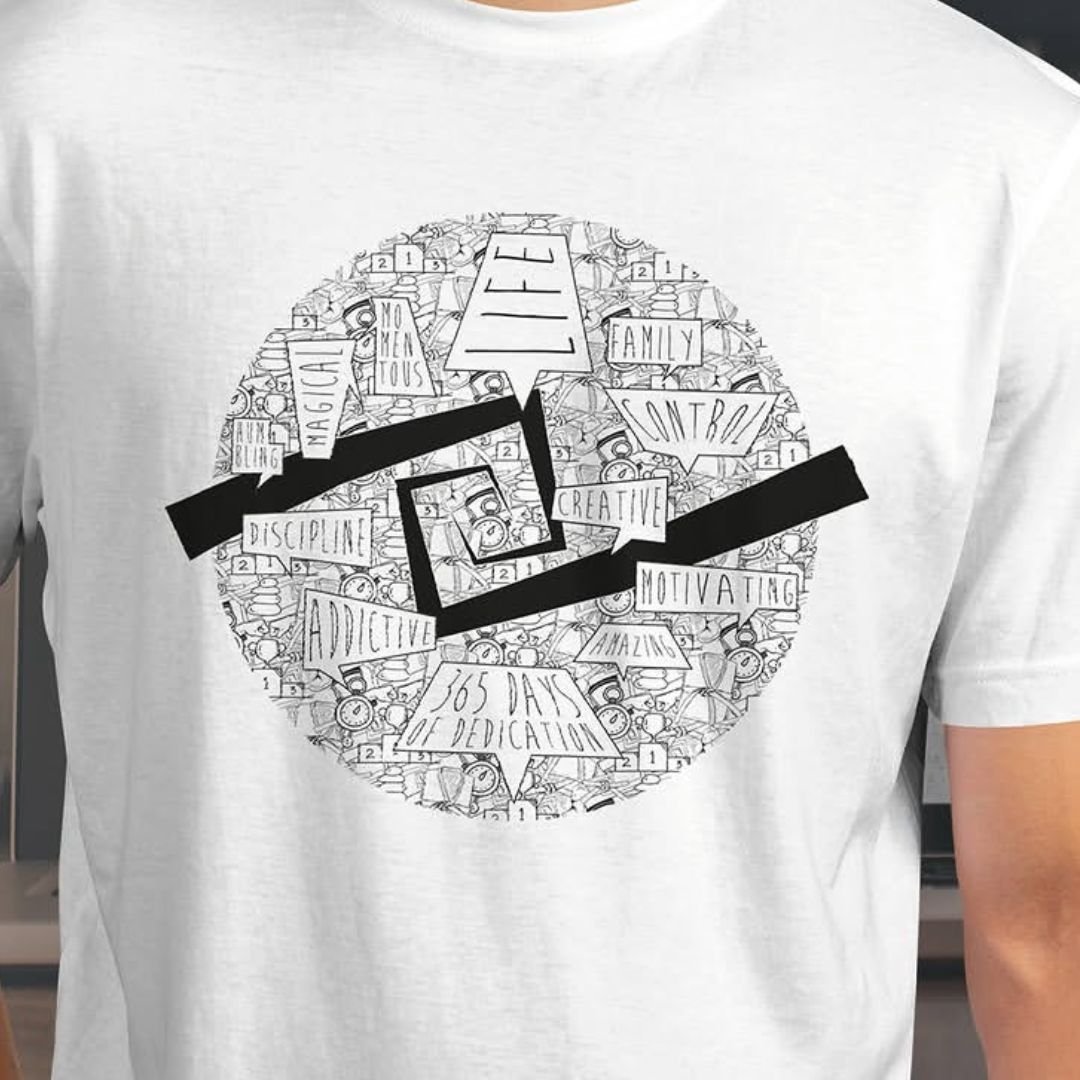
The design blends strength and elegance, with bold lines conveying power and refined details symbolizing the discipline and strategy required in every roll. The color palette and typography were carefully selected to reinforce the brand’s identity, making it stand out both on and off the mats.
This is more than just a logo; it’s a visual statement of the spirit of jiu-jitsu where every grip, every movement, and every connection matters.